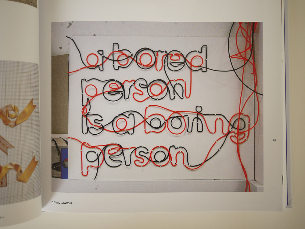
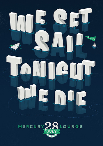
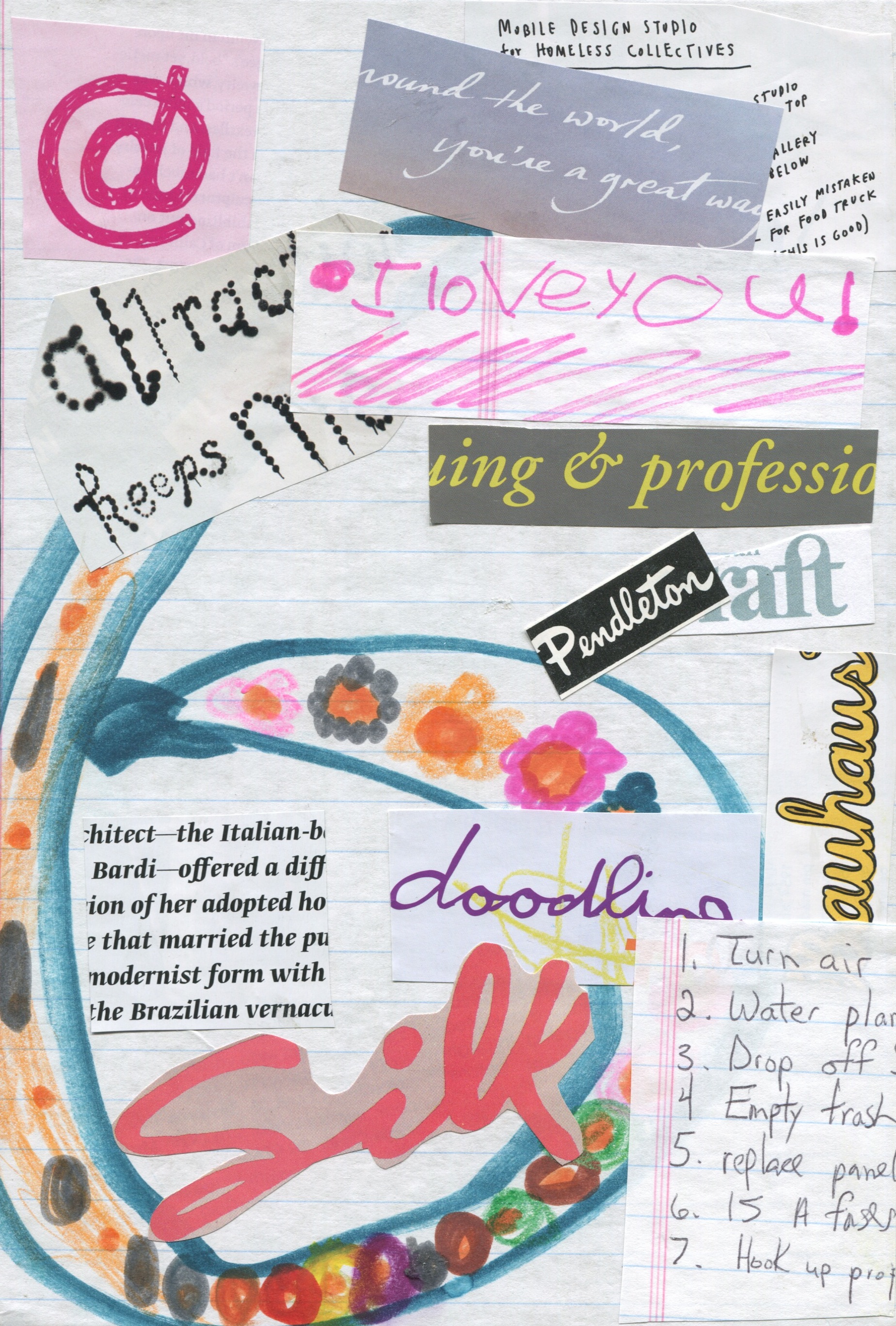
All of the things that I learned in that workshop are coming up now in my Typography class. Our readings have been focused on the anatomy of letterforms. I love this straightforward description of scale:
"Scale is the size of design elements in comparison to other elements in a layout as well as to the physical context of the work. Scale is relative. 12-pt type displayed on a 32-inch monitor can look very small, while 12-pt type printed on a book page can look flabby and overweight."
This is so true and I'm sure many people have had the experience of thinking that something looks just fine when on the computer screen, and in print turns out to be pretty hideous. It's ok, letterforms, we all have our flabby days!
Even better than flabby, I learned one of my favorite new descriptive words from the following quote:
"The default type size in many software applications is 12 pts. Although this generally creates readable type on screen displays, 12-pt text type usually looks big and horsey on a printed page (12 pts is a good size for children's books). Sizes between 9 and 11 pts are common for printed text."
Horsey!!! What a fabulous way to describe text, or anything really! While you generally want to avoid horsey text at school or the workplace, I think it's the horsiness that draws me so much to all those little treasures penned by my boyfriend and nieces. In fact, horsey is the perfect way to describe a lot of the people in my life, so I guess the reason that I love their handwritten letters is because they're so darn horsey!
While I'm on the subject of my nieces, I wanted to share something brilliant that one of them said the other day. I didn't witness this but it was passed along by my sister.
Annie to her sister: "you know what I love about you?"
Alexies: "what?"
Annie: "your imagination is so big I don't think it fits inside you"
From the mouths of babes...


